Strategy, Brand Identity, Brand Guidelines
Rebranding, Brand Guidelines, Web Design
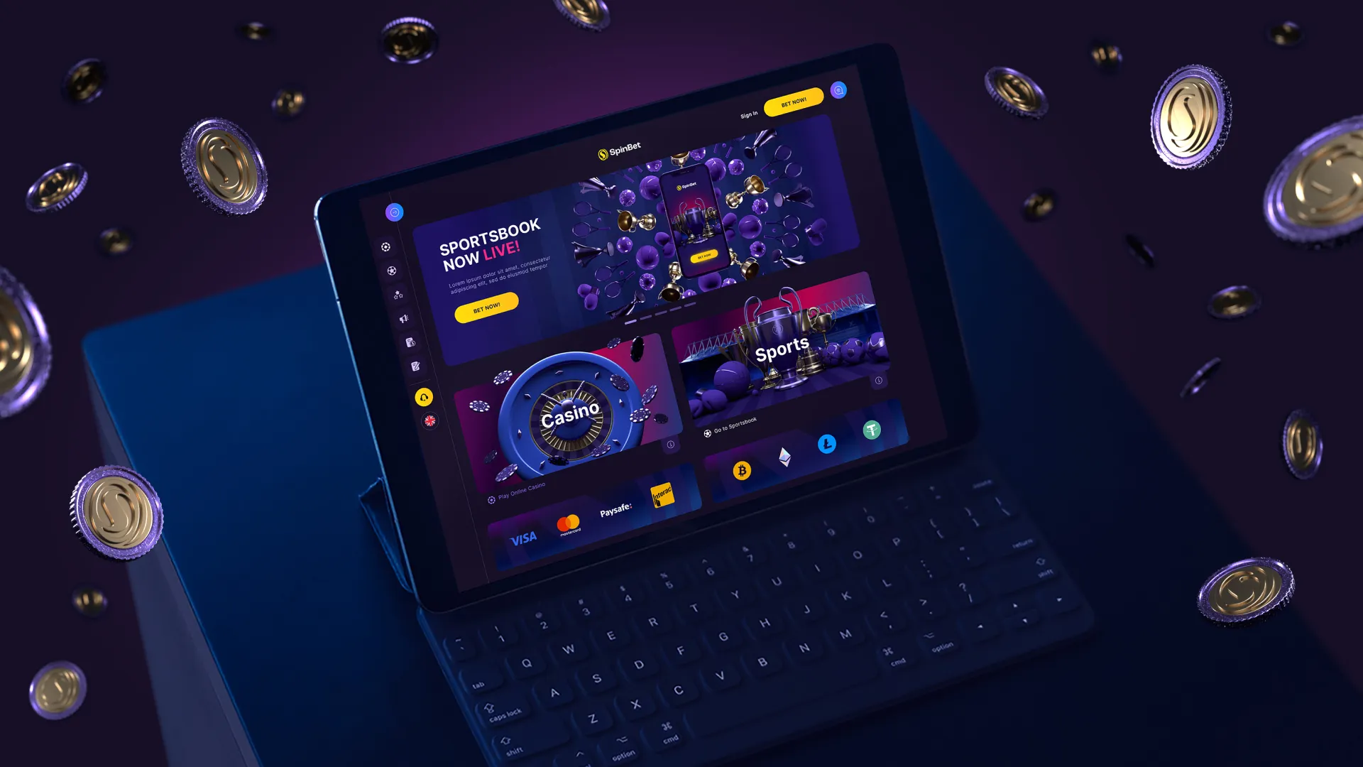
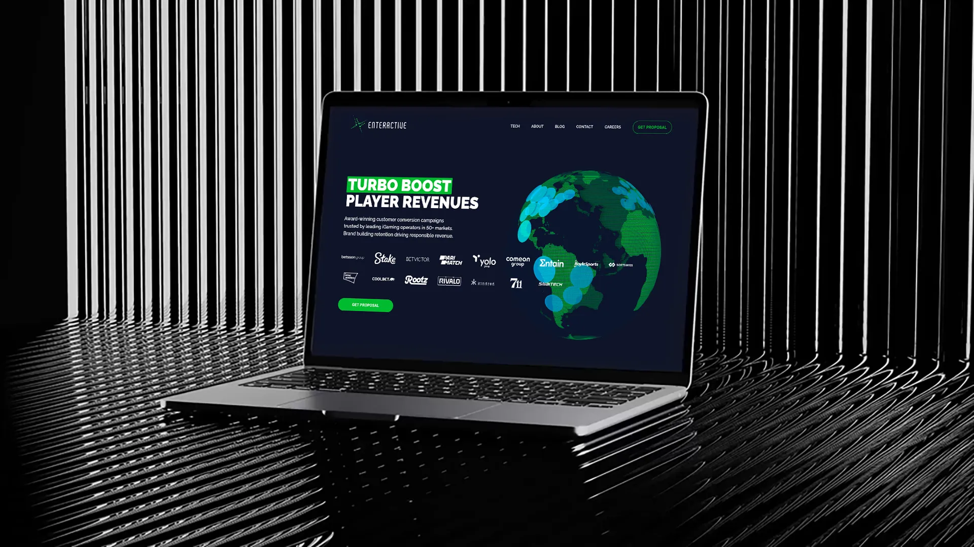
Web Design, UX/UI
UX/UI Design, Wireframing, Prototyping
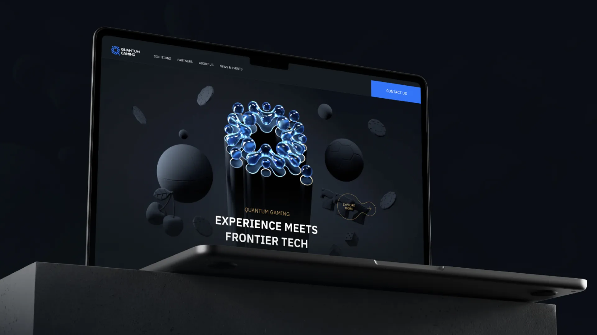
Brand Identity, UX/UI, Web Design
Branding & Identity design
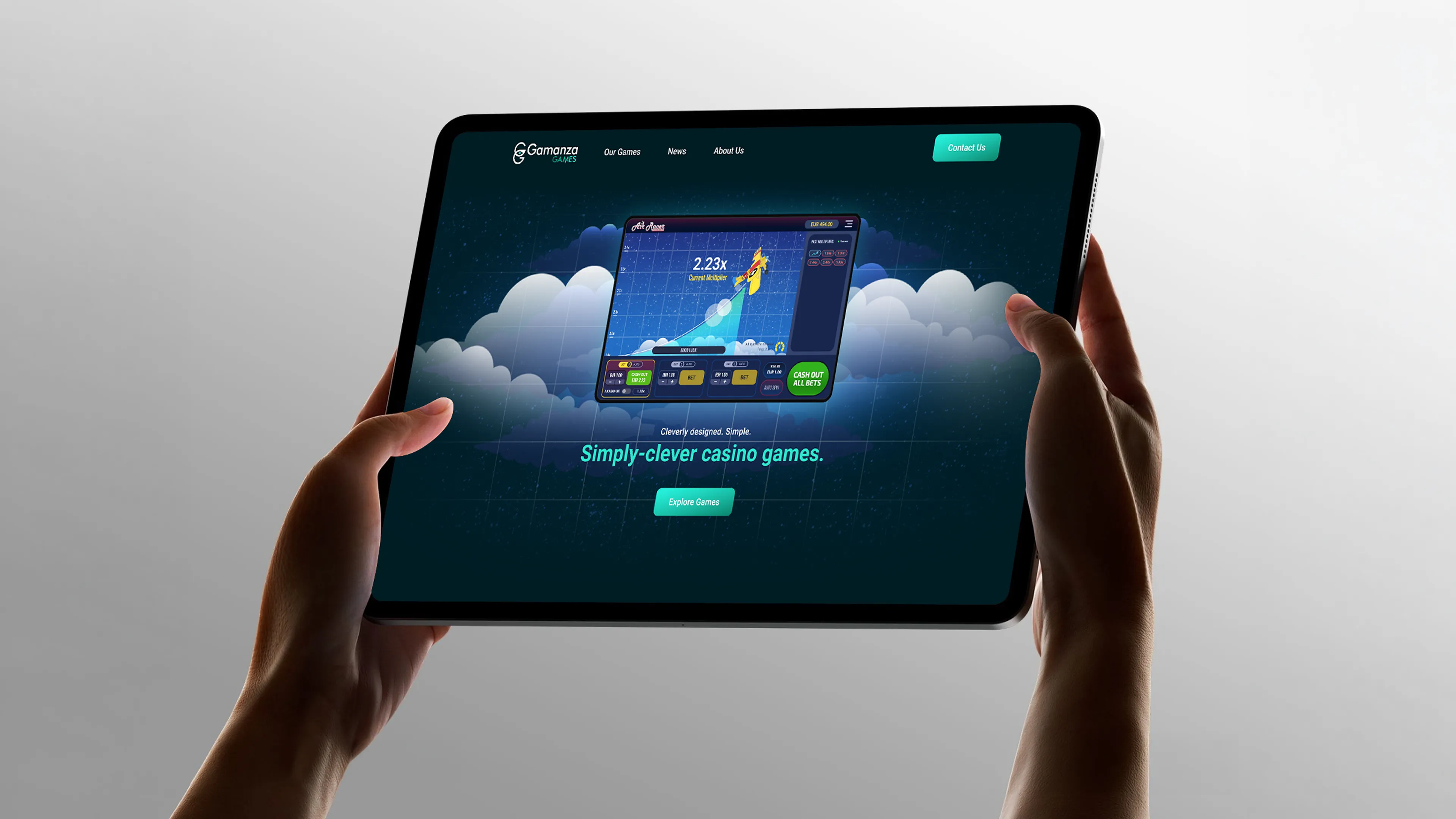
UX/UI Design, Web Design
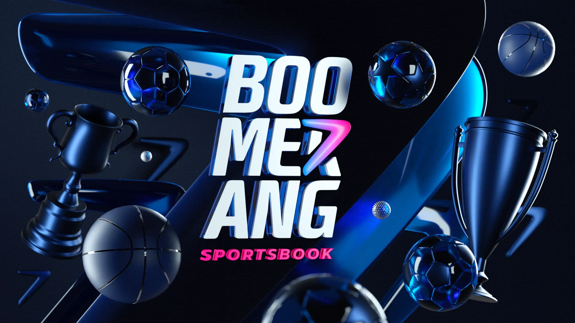
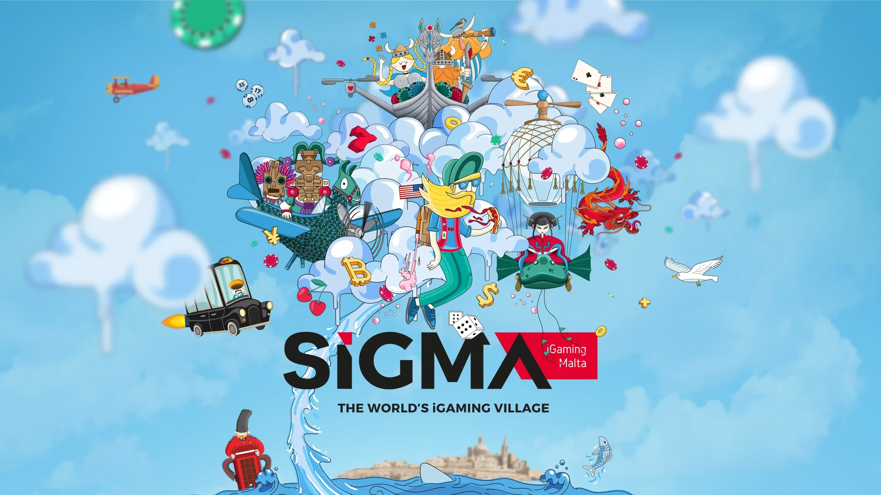
Annual Brand Campaign, Brand Strategy, Character Design
Brand Identity, Brand Guidelines
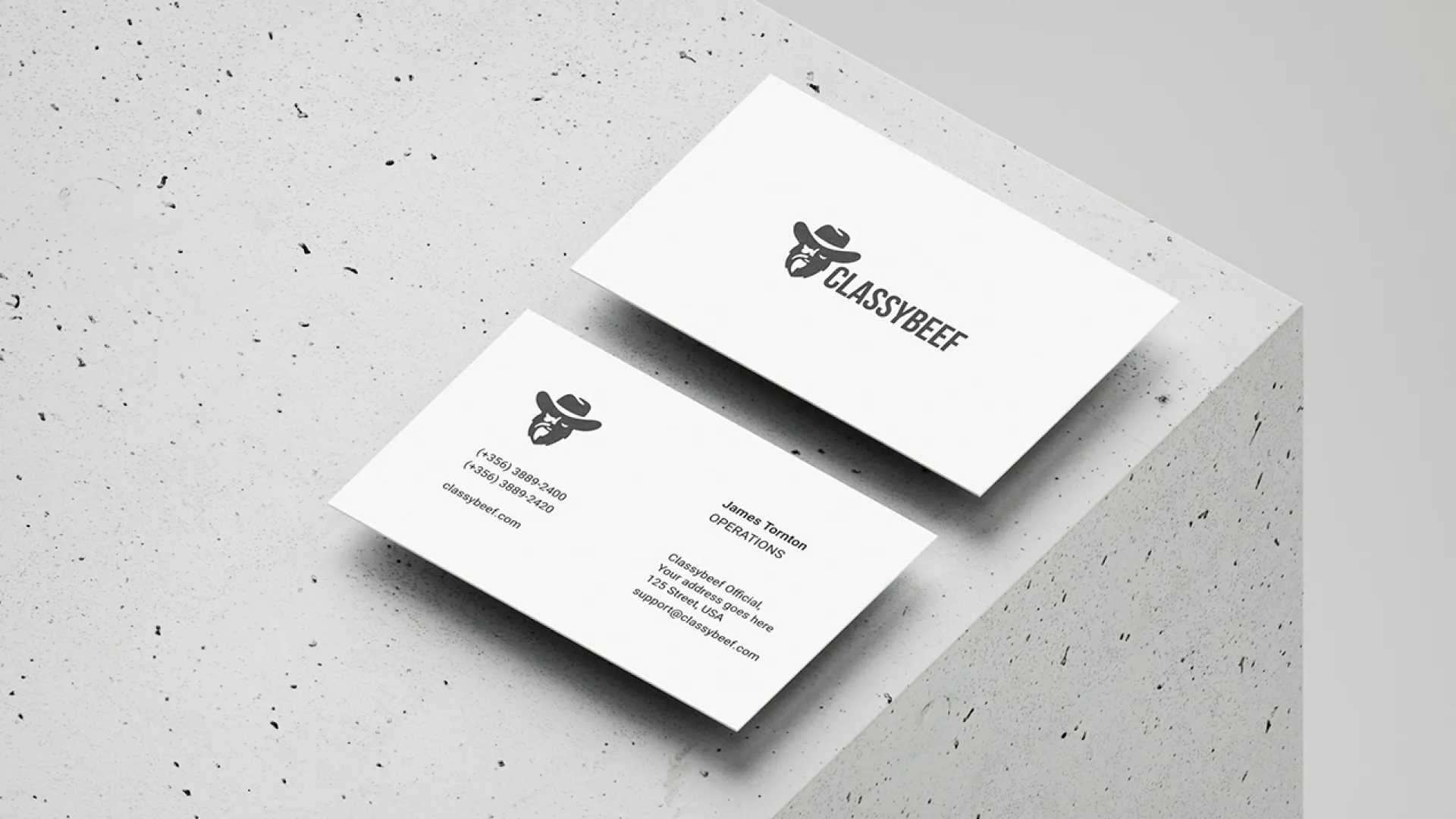
Logo Design, Visual Identity
Brand Identity, Interior Brand Concept
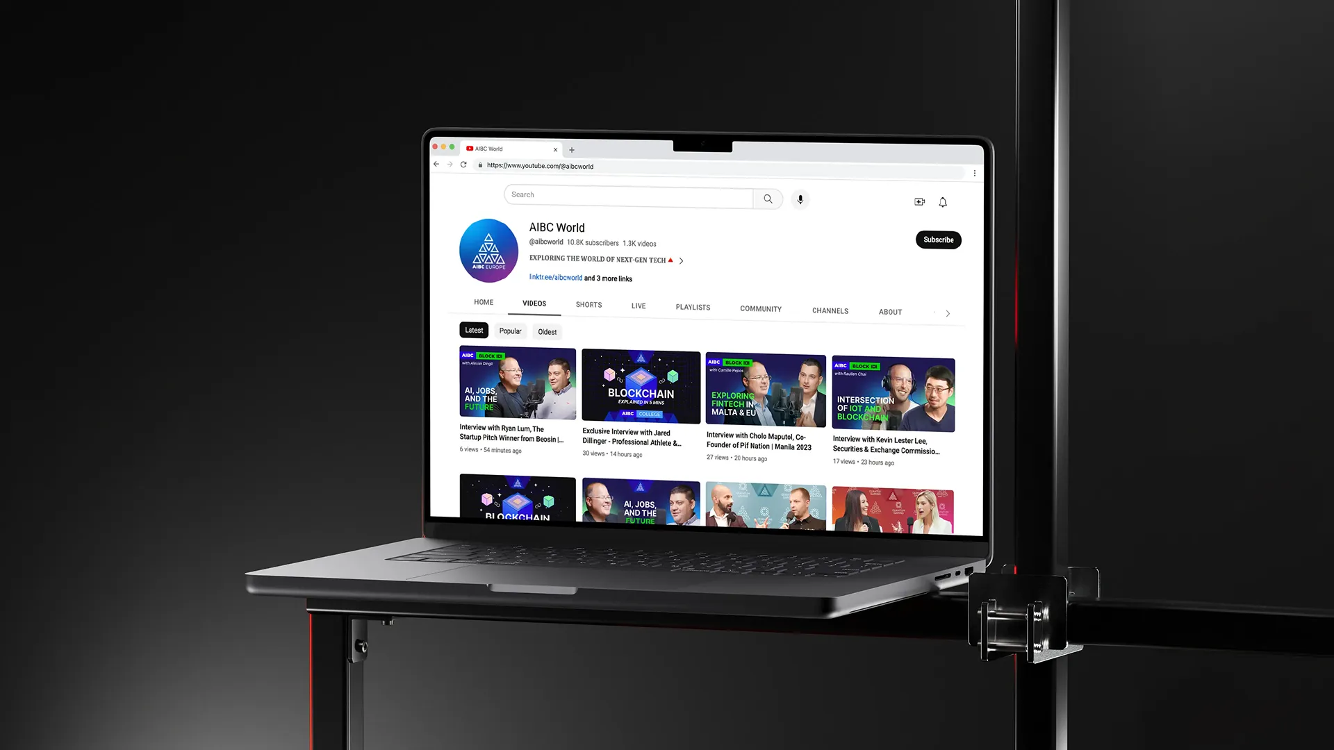
YouTube Redesign, Visual Content System
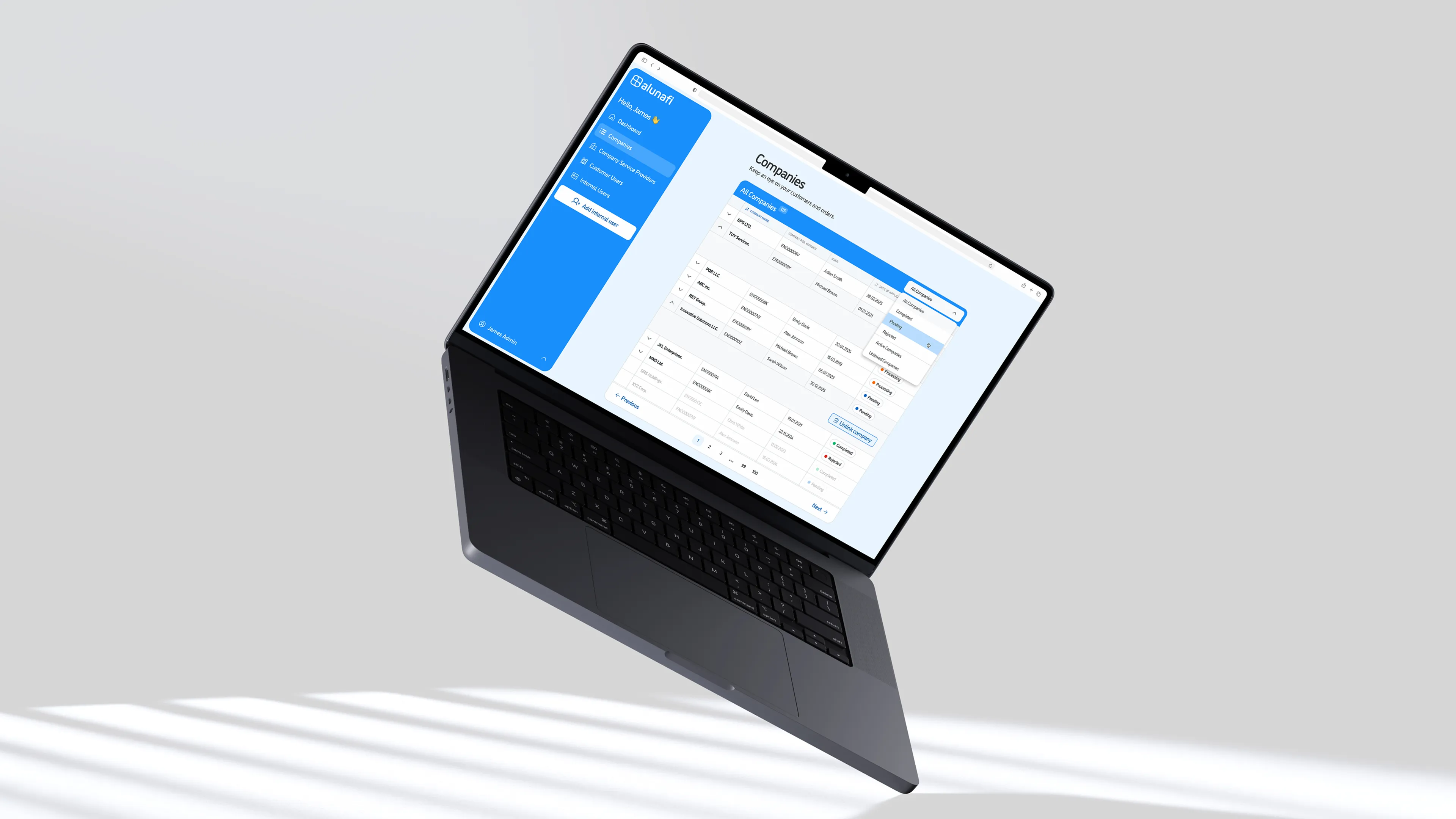
Product Strategy, SaaS Development, Automation Systems
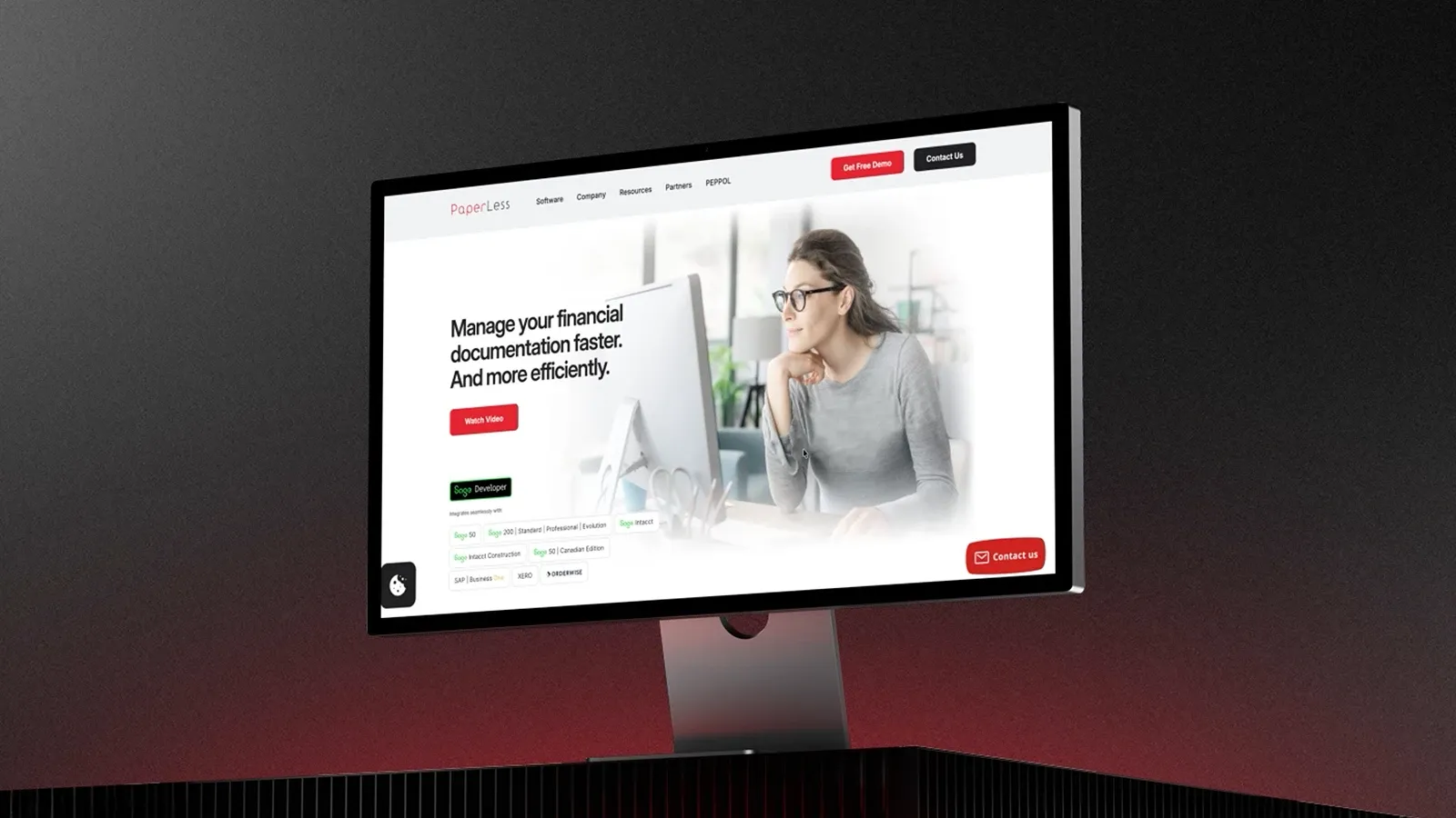
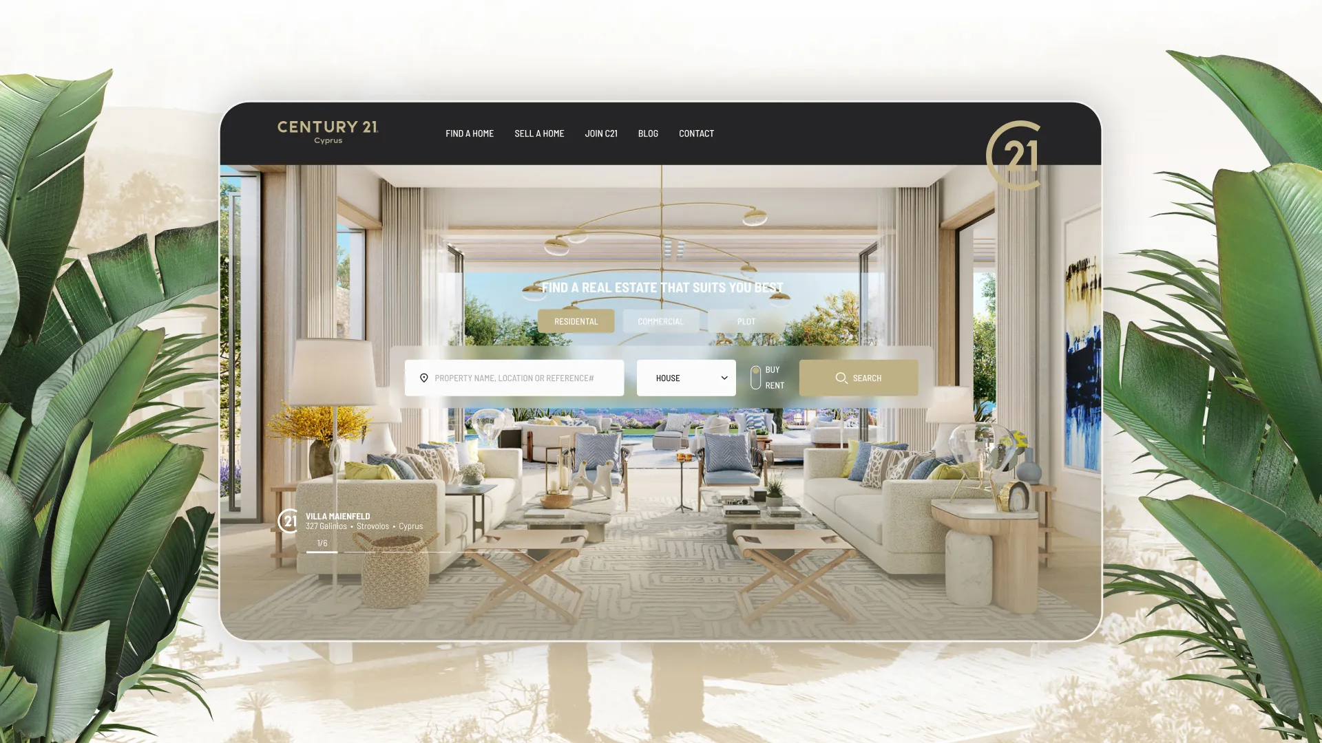
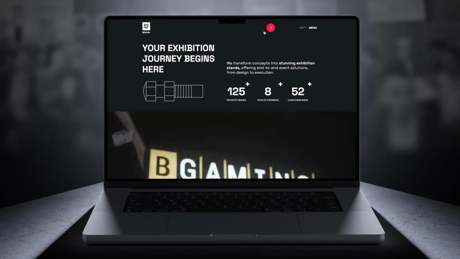
UX Strategy, Website Design, Web Development